Opensense Brand Guidelines
Follow these guidelines when you work with our brand. Here you’ll find our brand assets, logo, and more.
%20(1).avif)
Typography
Our typeface is Rubik for all headlines and body copy.
Rubik is a sans serif font family with slightly rounded corners designed by Philipp Hubert and Sebastian Fischer at Hubert & Fischer as part of the Chrome Cube Lab project.
%20(1).avif)
We are Opensense.
Defining a distinct and memorable brand requires thought, preparation, attention to detail, and flawless execution - at every touchpoint. In a digital-first world, the first touchpoint is often email. That’s where we help our customers guard their brands and grow their funnel.
Our manifesto is what we stand for - and what keeps us going.
For those who choose to stand out from the crowd; You were never born to blend in. Instead, you go all in to create brilliant, personalized experiences that delight audiences and inspire engagement.
You understand that the strongest brands in history are the ones that are built over time because life’s a marathon, not a sprint. They’re built with ambition, discipline, repetition, and imagination. You understand that a brand is not without the people building it, the people selling it, and the people buying it. You use technology to enhance your brand experience, not distract. You are thoughtful and deliberate about every single touchpoint. Good enough is never enough.
How you show up matters just as much as when you show up — and so, no communication is too great or too small to impact your brand, leave a lasting impression, and deliver value.
Small interactions to check in with a colleague.
Big interactions to service your customers.
Every single interaction becomes an opportunity to reinforce your brand’s purpose, redefine your position, and reimagine each relationship built with trust, recognition, and quality.
Our values guide our actions and define our culture.
.svg)
Innovate
Our goal is to lead the way to email innovation and breakthroughs. The foundation of who we are has been built on creating value from scratch through innovative thinking. Good enough is never enough, so we are always looking to go the extra mile. Email has stayed the same over the years, but we layer on value through practical and reliable innovation.
.svg)
Trust
Enterprise clients entrust us to be implemented on a server-side basis, and maintaining that trust and credibility is of utmost importance. We’re SOC2 compliant and have experts in email security to ensure we are offering the best product we can as leaders in the email compliance space. Our customer support team is built with honesty, reliability, and responsiveness at its core.
.svg)
Care
Relationships are important to us. We have genuine and deep care for our customers, our product, and for one another. We have a customer-first mindset, and our scalable approach to our product adds a layer of trust, value, and brand protection to every single email. These values are not just things that we believe in, they impact how we do our jobs, live our lives, and engage with the world around us.
Our voice is how we communicate and connect with our audience.
Informative
futile
We’re helpful, informative, and inviting. We’re not pretentious or condescending. We’ll address complex topics in a simple and digestible way.
Inspirational
lackluster
We’re imaginative and empowering. We’re out-of-the-box thinkers (especially when it comes to your inbox). We inspire brands to look at the world sideways, do things differently, and aim to stand out because, why not?
Authentic
silly
We’re intentional and purposeful. We’re thoughtful and deliberate about every interaction. We consistently invest in the little moments; the personal touches. It’s the only way to build lasting connections.
Primary
The full icon-mark and word-mark is the primary logo that should always be used (unless the secondary logo is a better choice due to space and legibility issues).
Secondary
The secondary logo should be used sparingly and only in cases where the overall design is symmetrical or the primary logo is too small and illegible.
Emblem
The icon-mark emblem should be used for social platforms, app icons, and for certain graphic design projects in order to create interest.

Logo Application
On Background
The full icon-mark and word-mark is the primary logo that should always be used (unless the secondary logo is a better choice due to space and legibility issues).
.svg)
Over an Image
When placing the logo over an image, the logo must be completely legible. Please maintain an appropriate amount of negative space around the logo as demonstrated.
%20(1).avif)
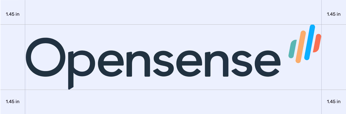
Minimum Space
Clear space is the area surrounding our logo that must be kept free of any text or graphic elements. By leaving space around the logo, we make sure it stands out on all of our communications. The minimum clear space is 50% of the height of the entire logo.
Each color in our color palette holds value.
Color is in order of importance, ranging from Azul being the most visible, to Carbon being the most subtle.