
This is a div block with a Webflow interaction that will be triggered when the heading is in the view.
- Why you should rebrand There are several reasons a business may want to initiate a full rebrand.
- “Rebrand” is one of those terms that often gets thrown around like confetti.
- In fact, it often includes a total overhaul of all the branding assets for a business - it’s.
- A lot goes into it and a lot that comes out of it.
- Whatever the reason, we want to make sure you come out of it better than before.
“Rebrand” is one of those terms that often gets thrown around like confetti.
And when used correctly, it can certainly be a cause for celebration. But contrary to popular belief, a logo redesign doesn’t qualify as a rebrand. That’s just a logo redesign. A rebrand, on the other hand, is big. In fact, it often includes a total overhaul of all the branding assets for a business - it’s no small feat.
A lot goes into it and a lot that comes out of it. Whatever the reason, we want to make sure you come out of it better than before. In this guide, we’ve rounded up our picks on the greatest and the not-so-great rebrands, lessons learned, and tips that will help keep your team on the path to success for your own rebrand.
- Is a rebrand the right choice?
- Why you should rebrand
- Why you shouldn’t rebrand
- The greatest rebrands in history: Best Practices
- The not-so-great rebrands: Lessons Learned
- How to get started
Is a Rebrand the Right Choice?
Deciding between a few minor adjustments to branding elements and a total rebrand is no small task.
Unfortunately, many companies make the mistake of rebranding only to realize a few years down the road, that they have to do it all over again. So how can you know if a rebrand is right for you and your business? As Simon Sinek would say, start with why.
Why you should rebrand
There are several reasons a business may want to initiate a full rebrand. It typically starts with a disconnect between what your brand currently portrays and what you’d like it to portray.
Here are the most common reasons we see:
- When you’re changing direction
- Changing your product or service offering
- When you want to reinvigorate your base
- When you want to modernize your look
- When you want to get away from a bad rep
- When your company vision has shifted
- When you want to shift consumers' perception of your brand (McDonalds after SuperSize Me).
Whatever your reason, your previous branding may no longer reflect the direction you’d like your business to go. So if you're feeling this dissonance between your current brand story and the story you’d like to tell, it might be time for a rebrand.
Examples of Necessary Rebrands
As we’ve already mentioned, a disconnect between where your brand is currently and where you’d like it to be is often a good enough reason to explore the possibility of a rebrand. But what does this actually look like?
Perhaps you’ve built your business around a single persona - say, you sell to marketing managers but over time, you’ve rolled out some other product suites that now appeal to sales managers as well. In another scenario, your business model may have entirely changed from a service-based business to a consumer app. This might mean that your company branding no longer aligns with your offering, and a rebrand is the right way around it.
Finally, a scenario we’ve seen a lot recently - your company branding may not be up to date. You’re losing out on customers and unable to capture your audience's attention because your brand gives off that early 2000s energy (and not in a cool retro way). Companies who choose to sport an old school logo still have to make adjustments to their design.
Keep in mind, a slight shift in trends isn’t enough to justify a full-on rebrand, so be sure to do research to help you feel confident about your decision and do it right the first time around.
Why you shouldn’t rebrand
Don’t initiate a rebrand simply because you’re looking to shake things up. Not only does rebranding require a considerable investment, it also requires months (and for the big guys, years) of additional work and attention to ensure a smooth transition from one brand to another. If your internal teams feel bored with your current branding, shift the focus to other initiatives to help mitigate those concerns.
On the other hand, if your audience is bored, you may have valid reasoning for a rebrand.
Rebrands that go down in history (not-so-greats & the greats)
The world has watched some of their most beloved global brands undergo branding evolutions. We’ll look at rebrands from Burger King, Instagram, and the not-so-great rebrands like GAP and Snapchat. In addition, you'll learn some best practices and execution tips from our very own rebrand that you could apply to your own business before venturing out to do your own rebrand.
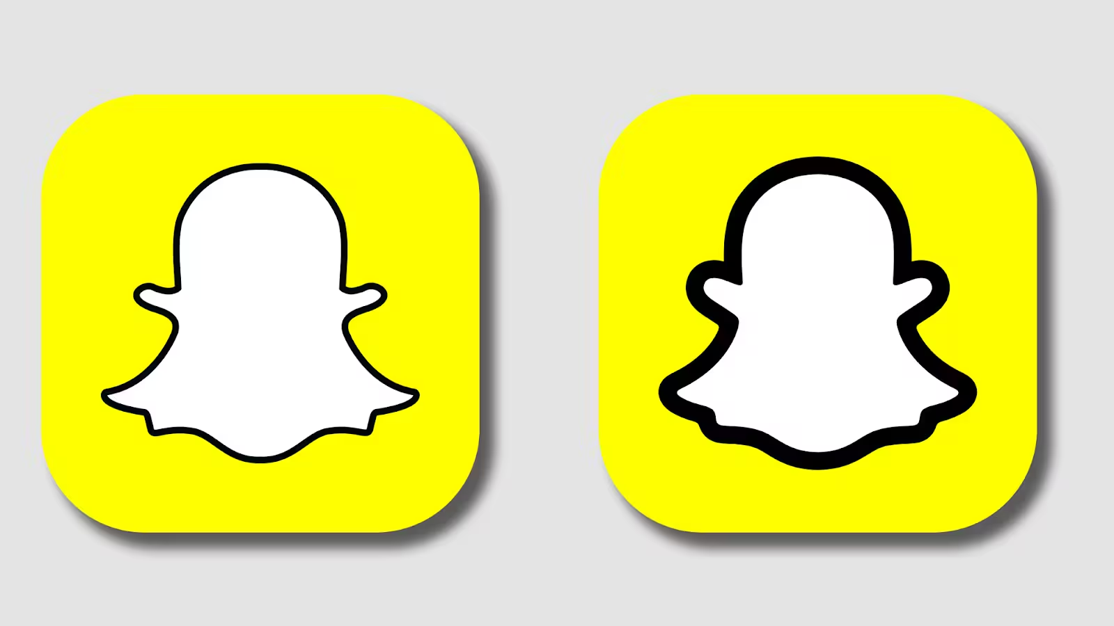
Not-so-great rebrand: Snapchat
We've all seen our favorite social media apps undergo a rebrand. I am sure most of us shared our opinions of the rebrands with our friends and colleagues. I think you would agree that one fairly recent rebrand that missed the mark is from our old friend, Snapchat.
While it has seen an uptick in user growth in recent years (thanks to the pandemic and a very bored Gen Z), the world has watched them crash and burn through a series of UI and UX updates and poor branding decisions. Instead of trying to stay modern and functional, Snapchat took things a bit too far by trying to set the tone for messaging and photo sharing apps. This led to a very difficult to navigate app.
As a result, they overshot the needs of their users and ended up just confusing them more than anything. The result? They lost 3 million users and provided a petition on change.org with 1.2 million signatures from users begging them to revert the update.
In sum, what caused their continued downfall? Poor planning, design and inadequate user research. Snapchat's only saving grace is that its users have memories embedded into their app that they haven't tried to extract ( else, I would have deleted Snapchat years ago).
If they instead, slowly transitioned their users to the new changes, spent more time building out focus groups of their top users testing out their platform, and performed a series of A/B tests, their fate could have been different. If your brand has a lot to lose, you could lose a lot by not spending more time easing your users into your vision.
What are your thoughts on Snapchat’s rebrand and do you know how to export saved pictures in bulk?
Not-so-great rebrand: GAP
If you thought Snapchat was a mess, you won’t be able to grasp Gap’s train-wreck rebrand. Heck you probably didn’t even know about their big rebrand because it only lasted a week.
That’s right. In one of the most notable events in Gap’s marketing history, took them only 7 days and $100 million to realize they made a mistake.
Gap made the premature decision of modernizing their logo to something “new and fresh” dropping their 40 year-old historic logo with absolutely zero warning, zero regard for their customer base, and with zero respect for their iconic brand. Gap’s logo had decades of history that allowed consumers to recognize their brand instantly. When they made the decision to swap their logo, they failed to consider the fact the different components of brand itself including the fact that their value prop, their apparel, and their physical retail establishments wasn’t changing.
So why the drastic logo change?
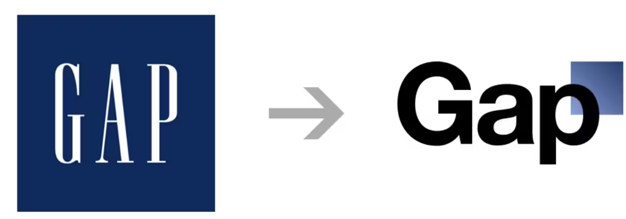
Turns out, it was an unnecessary choice that shocked consumers enough for the to demand the change back. 7 days later, Gap reversed their decision and tip-toed back to how it use to be. Read more about this unplanned rebrand here.
Great rebrands: Burger King
Burger King outdid themselves. And for good reason. After sporting the same look for nearly 20 years, the Burger King franchise decided to roll out their new brand with a bang. To take on this task, they enlisted help from a world-renowned agency to recreate their visual identity, and boy did they do it.
Though their efforts are still rolling out almost 3 years later (global brands are big, and big and big brands require big plans and long timelines to reinvent themselves), the fast food giant found much success after giving their brand a major facelift.
The biggest change we can see is that their new logo just feels more natural. The artificial blue swish is no longer there and their shiny buns feel so much less plastic. Burger King’s previous logo inspired a flatter, organic, and more modernized identity that’s now perfectly integrated throughout their packaging, franchise locations, digital assets, and more.
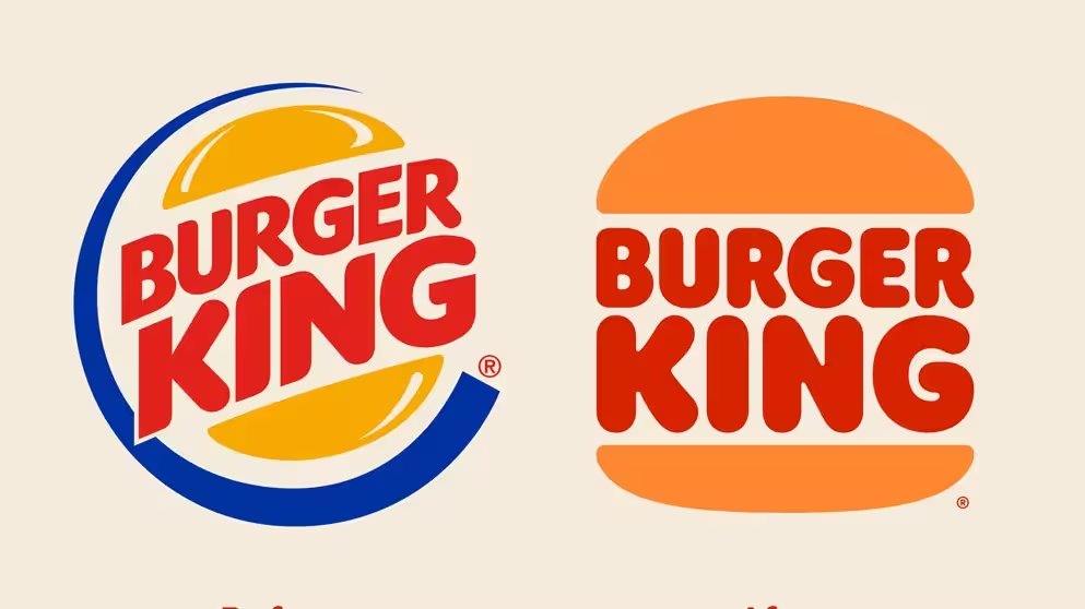
That was a primary motivation of the rebrand. According to Lisa Smith, the executive creative director who helped spearhead the project: “We wanted to use design to close the gap between the negative perceptions people have of fast food and the positive reality of our food story by making the brand feel less synthetic, artificial, and cheap, and more real, crave-able, and tasty.”
Like all the best companies in the world, the team at Burger King made sure to deliver on their new brand experience at every possible customer touchpoint: new color palette, custom graphics to social media, icons, fonts, new packaging, uniforms, menu and restaurant design.
What do you think about Burger King’s rebrand?
Great rebrands: Instagram
The next rebrand is one you’ll likely remember. If you’re anything like every Instagram user at the time, you were a bit shocked, either camp yay or camp nay. It was a polarizing new look. It’s not a good or bad thing for Instagram - it was actually a reaction that anyone could have predicted, especially because Instagram’s most notable (and powerful) change was their app icon that we had all grown used to.
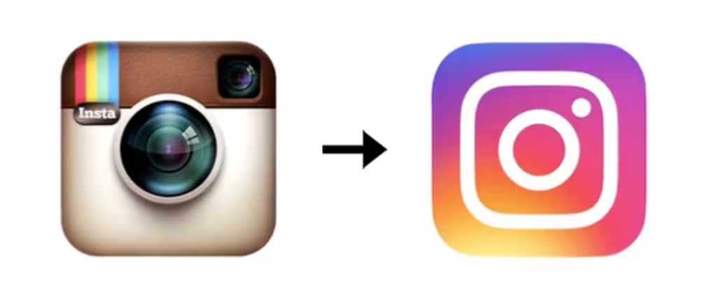
Initially, logo change and app changes are met with negative feedback. It can be inferred that users aren’t very receptive to changes of their beloved apps. Now, the minimalist “aesthetic” has aged well over the past 6 years as more apps are simplifying their logos today.
Switching from an outdated Polaroid camera to a minimalist camera icon with a trendy color scheme was a monumental change for this billion dollar brand. Another reason for the big change was that they were expanding past only photos. Features like reels and boomerangs are well integrated in the app now, making Instagram more multifaceted than its competitors. It was a smart move that they needed to make to stay relevant.
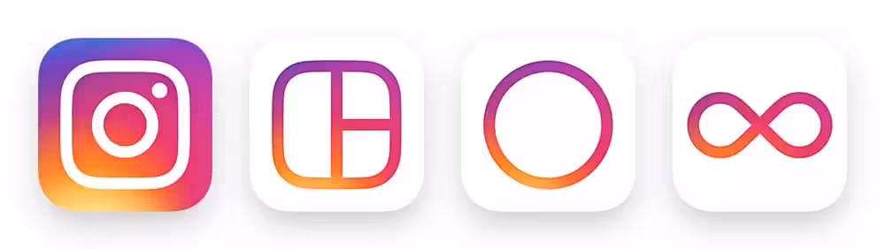
Keeping up with the trends and staying ahead of the marketing game allowed instagram to find continued success well past their rebrand.
Kicking off your rebrand: How we did it.
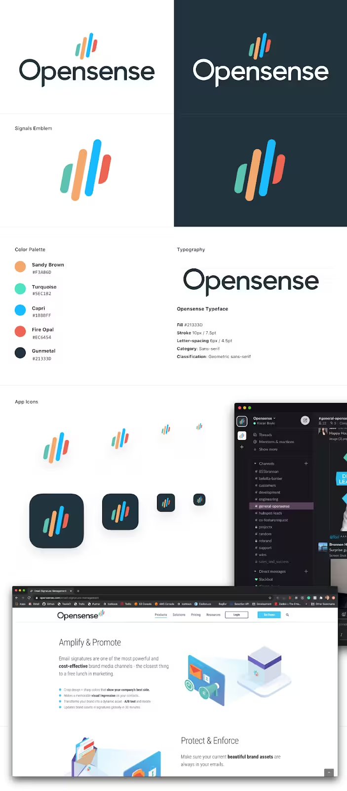
If you’ve decided to undergo a rebrand in your own business, there are several ways you can begin to make progress on a project like this without pulling a Gap. At Opensense, we made the decision after years of deliberating that it was time.
There was a combination of several factors that motivated our change:
- The decision from upper management
- The logo was too similar to Slacks new logo
- Need for a more modern brand aesthetic & website
Step 1: Uncover the core of your brand: First, you’ll want to get familiar with the non-visual aspect of your brand, as these will help inform the visual element of your rebrand. This is the spirit of your brand. It's your story, messaging, and values.
- What does your company truly believe in?
- Who do you want to be in 5 years?
- What makes you different / better than your competitors
- What are your ideal customers trying to achieve
- What are your ideal customers NOT trying to achieve
Step 2: Define your unique value proposition: Do your research about your industry, your target audience, and any identifiable future trends in the marketplace or your business. This information will help you differentiate yourself from the competition while still standing out to your core audience and consumers.
- What are my ideal customers trying to achieve?
- Who am I competing with to win these customers?
- What do these competitors do better than me?
- What do I do better than them?
Step 3: Develop a visual identity: Consider the different places your new designs will reside and mock them up to have a clear visual understanding of the change you are about to make. Be extremely thorough in your creative brief.
- Mood board
- Your uniform
- Logo / icon
- Color palate
- Design elements
- Email signatures
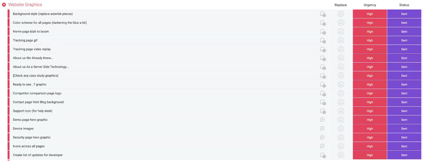
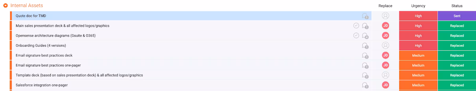
Whether you are working with an external agency or working internally to plan the rebrand, you'll need to scope out your timeline, budget and enlist help from your team to ensure a smooth transition. One way to do this is to build a project on Monday.com, Trello, or Asana.
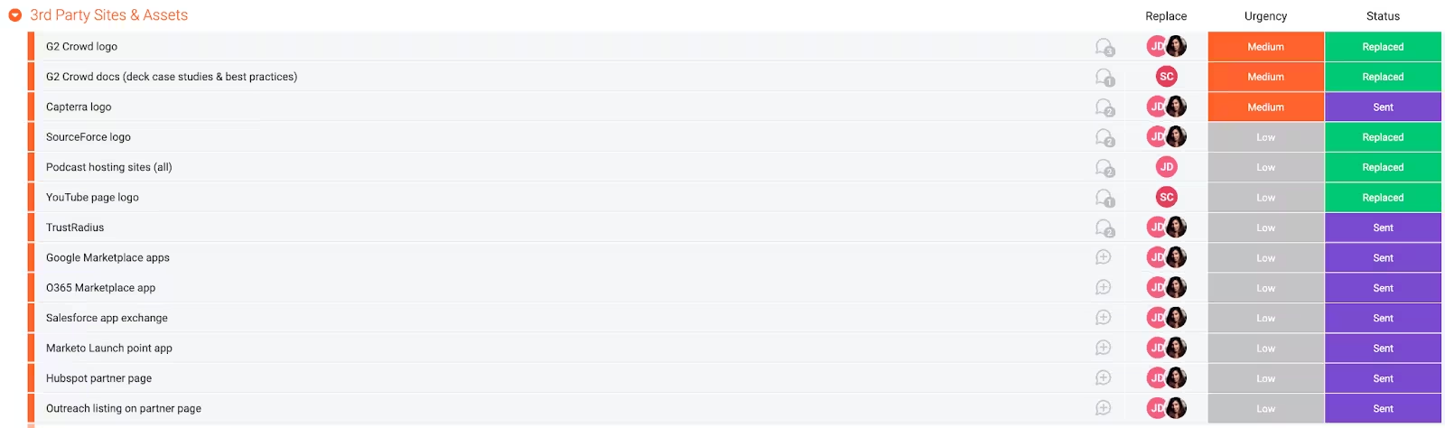
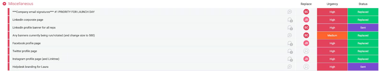
We built 4 different sections into our Monday board, organized it by urgency level, and included a status for each item. In addition to the status, each task had an owner assigned to it (a member of our team responsible for completing that item).
If there was an issue with an item or some notes that we needed to share with the team, we'd use the chat functionality to enter all comments and assets of that specific item (see below).
This helped mitigate any confusion and keep all of the tasks organized.
- Website Graphics - Homepage, graphics on all relevant pages, color schemes for all pages, landing pages, etc.
- Internal Assets - email signatures, sales decks, customer welcome packets, one-pagers, onboarding guides, etc.
- 3rd Party Sites - G2 Crowd, Capterra, YouTube, Podcast hosting sites, TrustRadius, Google Marketplace, etc.
- Social Media - LinkedIn company banners, employee personal LinkedIn banners, Facebook Profile Pages, Instagram, etc.
Here’s how we organized each task:
- Urgency level
- Low
- Medium
- High
- Status
- Working on it
- Ready to replace
- Replaced
- Sent
- Stuck
Final Thoughts
By now, you should have a solid overview of what a rebrand is and what that process looks like.
Remember, your brand was not built overnight, and the change won't happen overnight either. Some tasks may take longer than you anticipated, and that's okay. Enjoy the process, learn from the lessons and successes of other brands, be practical with your goals and timelines, and make room for editing after launching. Finally, when you are at the point where you can finally celebrate the launch, celebrate it. Either publicly or privately.
We wish you all the best with your rebrand - if we can help in any way, feel free to hit us up.